Case Study: Cleaning Up Barb’s Notion (So She Finally Knew What to Work On)
Feb 27, 2026

How Barb Went From Notion Chaos to a Calm Client Command Center
Barb has five brands.
Not “five tabs open.”
Not “five little projects.”
Five full brands, multiple employees, and a workflow that was starting to feel like… how are we even doing this?
So when we opened her Notion on our first call, the problem wasn’t that she didn’t try.
She’d tried templates.
She’d tried different task views.
She’d bought things and built things and tweaked things.
But it still felt clunky.
And the biggest issue was simple:
Even with tasks technically in Notion… she still wasn’t sure what she was supposed to work on.
So we didn’t rebuild her life.
We cleaned up the friction.
The “Before”: what wasn’t working
On Call #1, Barb’s priorities were clear:
Gmail → Notion tasks felt ugly and annoying (she wanted one clean flow)
Her task views felt clunky
Client tasks vs personal tasks blurred together
Updating clients externally felt like extra work (she didn’t want clients inside her Notion)
She wanted marketing + tasks to feel connected (without forcing everything into one giant table)
She needed an ideas dump that wasn’t a messy random doc
And… the sidebar was full of old templates/pages she didn’t use but didn’t want to delete
In ADHD terms: the system required too much remembering and deciding.
The goal
Give Barb a workspace that feels:
lighter to look at
obvious to use
easy to plan tomorrow
and simple to separate client work from everything else
Basically: one place to open and immediately know what matters.
What I built for her (the cleanup + rebuild)
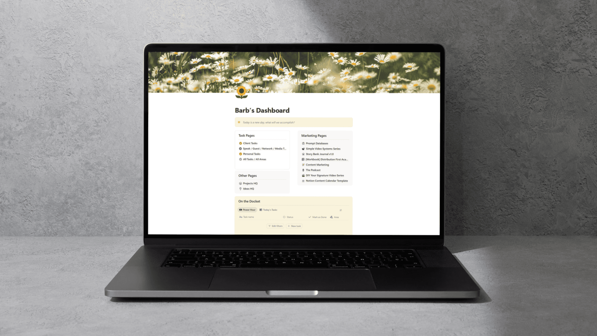
1) A real home base: “Barb’s Dashboard”
Instead of living in the sidebar, Barb now lands on one dashboard that holds everything she uses most.
It includes:
task shortcuts + task views
a resources area
an ideas area
navigation links so she doesn’t need the sidebar taking up screen space
This alone reduces mental load because she isn’t hunting for pages anymore.
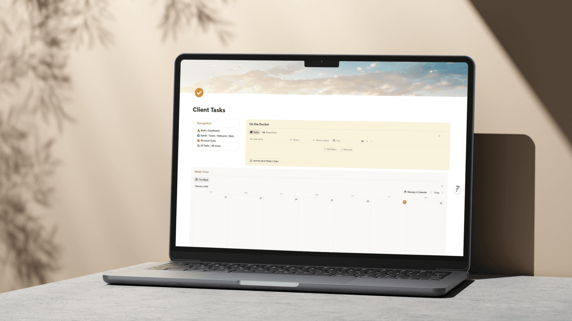
2) A “Client Tasks Command Center” (with Today + Power Hour + Week)
This was the transformation that changed everything for her.
I created task pages that split tasks into three main ways of working:
Today
a short, realistic view of what you’re doing now
Power Hour
a checkbox-based “focus list”
so you can pick only a few tasks and stop your list from bullying you
Week view
drag-and-drop scheduling using her Schedule Date
so she can plan ahead OR reshuffle as the week changes
And then at the bottom: All Tasks, so nothing disappears—it just becomes easier to choose.
Barb’s exact words after seeing it:
“The tasks alone for my clients are ridiculously better. Like that alone is worth everything.”
That’s the whole point: if the tasks feel easier on the brain, the system finally gets used.
3) Automatic client grouping (without complex tagging stress)
Barb wanted to quickly see tasks by client.
So her task pages now include tabs filtered by client identifiers (like KD / CDS / OV / MM).
Even if she forgets brackets or formatting, it still sorts cleanly as long as the client code is in the title.
Result: she can literally say, “I’m working on KD today,” click one tab, and only see KD tasks.
4) A “Done” button that creates a completion log
I added a Done button that:
marks the task complete
automatically stamps a Date Completed
and groups completed work by completion date
So if she ever needs to look back and say “what did I do last week?” it’s already documented.
(And yes, it’s also kind of fun to press. That matters.)
5) Navigation on every task page (so she can hide the sidebar)
Each task page includes a small navigation section so she can jump around without giving her screen space to the sidebar.
We even hid extra database buttons to make it feel cleaner.
Small visual shifts, big brain relief.
6) A Resources Library that isn’t a random pile of pages
Instead of scattered notes and docs living all over, Barb now has a Resources database with:
a Favorites checkbox (to surface what she uses most)
a Show on Mobile checkbox (so key resources appear on her phone)
filtered tabs for categories she mentioned (Tools, Education/Research, etc.)
a gallery option so she can see what a resource is without opening everything
And the coolest part:
Resources can have related tasks
Inside any resource page, she can add tasks tied to that resource.
Example: “Tactics to try” becomes a resource… with tasks underneath like:
test this tactic
try it next week
review results
So ideas don’t just sit there—they can turn into action when she’s ready.
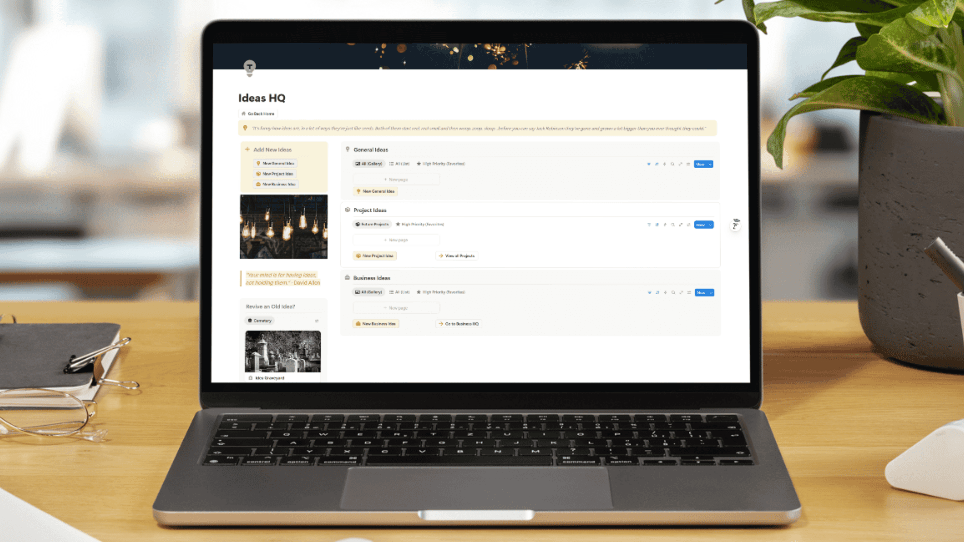
7) An Ideas page that makes brain-dumping feel organized
I added an Ideas page with quick-add buttons like:
new general idea
new project idea
new business idea
And the fun part: an Idea Graveyard.
So when an idea stops feeling aligned, she can ditch it without deleting it.
And if she changes her mind later? There’s a revive option.
This is one of the best ADHD-friendly features because it removes the “I have too many ideas and now I feel bad” spiral.
8) A Mobile page that actually gets used
Barb also has a Mobile page designed for real life:
Today tasks
Power Hour tasks
resources marked “show on mobile”
quick access buttons
We also talked through optional setups like:
a “mobile inbox” for Siri / quick capture
auto-assigning “today” when adding a task via button
Even without going deep here yet, she has the foundation and the flexibility.
The result: what changed for Barb
The system didn’t just look prettier, but it made decisions easier.
Here’s what Barb said after the rebuild:
“It looks cleaner. It is easier on the brain.”
“I can have just the ones I want to work on.”
“I’ve never really taken the time to say what am I going to work on the next day… but this will take some of that away.”
That’s the win.
Because when the system helps you choose tomorrow today, you stop walking into your workday already overwhelmed.
Why this worked (the real lesson)
This was not a “more features” project.
It was a friction removal project.
We focused on:
reducing visual clutter
creating one home base
shrinking the task list into usable slices
separating clients cleanly
making ideas + resources actionable
and supporting how an ADHD brain actually moves through work
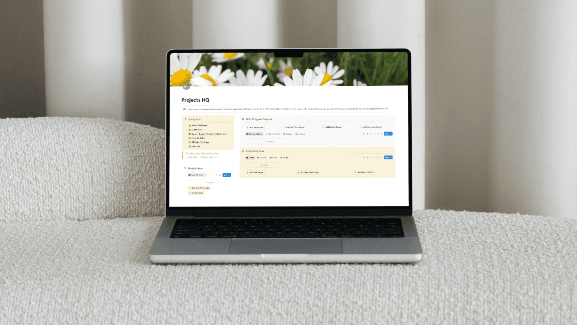
What’s next (optional expansion we discussed)
Because Barb now has a solid foundation, it’s easy to expand without breaking anything.
Next upgrades we discussed:
migrating in a full Projects workflow (ideas → projects, progress tracking, project tasks)
adding project views to the task pages (client projects vs personal projects)
refining mobile capture (Siri inbox / button presets)
This is my favorite kind of system: one that starts simple and grows with you.
If your Notion feels like Barb’s “before”
If your Notion is full of:
half-used templates
messy views
one giant list you avoid
and pages you can’t find unless you search…
You don’t need a brand new setup.
You need a cleanup that makes your brain exhale.
If you want, I can turn your Notion into a dashboard you actually use, with tasks that tell you what matters, and a structure that stays clean as your life grows. Book an intro call to talk about your options.